

The Approach That Sounds Risky and Delivers Results
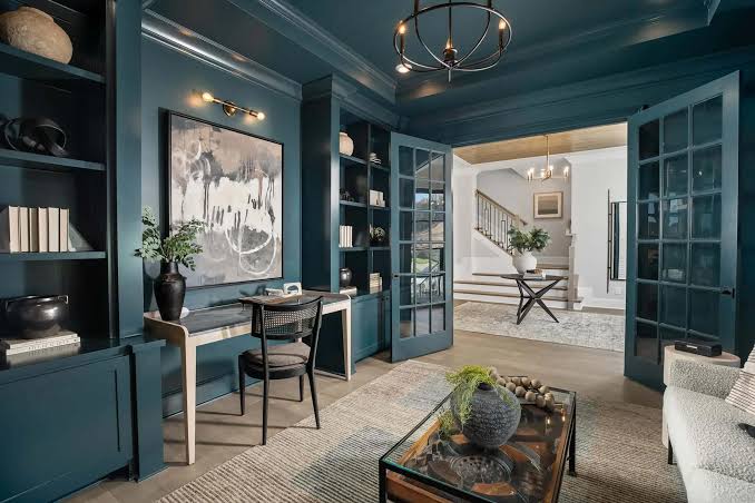
Color drenching — painting the walls, ceiling, trim, and sometimes even the floor of a room in the same color or in closely related tones of the same hue — is one of the most impactful and most counterintuitive interior design techniques available for residential spaces. The common assumption is that painting everything the same color will be monotonous. The experience is the opposite: a properly color-drenched room creates an enveloping, immersive quality that’s impossible to achieve with the conventional walls-one-color, trim-white approach.
Color drenching has moved from a designer’s technique to mainstream residential use, driven partly by its appearance in design publications and partly by the recognition that it requires no special skill — just the willingness to commit to a color throughout the entire room.
Why Drenching Works When Conventional Color Doesn’t
The visual effect of conventional color application — colored walls with white trim — is that the trim lines chop the room into segments. The eye tracks the white lines at corners, door frames, and window frames rather than experiencing the room as a unified space. Painting the trim the same color or a slightly deeper tone of the same hue eliminates this segmentation, allowing the eye to travel freely through the space and experience the color as a complete environment rather than a series of colored panels.
In smaller rooms particularly — the powder room, the office, the entry hallway — color drenching eliminates the visual shrinking effect of contrasting trim lines and creates a room that feels deliberately intimate rather than accidentally cramped.
Choosing the Right Color for Drenching
Not all colors drench equally well. Colors that work best for drenching tend to be: mid-to-deep saturated tones (pale colors drenched throughout a room look washed-out rather than immersive), colors with strong enough character to establish a mood when they surround you completely (a tepid beige becomes more tepid when drenched; a warm terracotta becomes more inviting), and colors that you genuinely love rather than colors you merely consider tasteful.
Colors that work particularly well for drenching: deep forest green (creates a library-like, sophisticated envelopment), warm terra cotta or brick red (creates warmth and energy), navy or deep slate (creates gravitas and quiet drama), and dusty rose or deep blush (creates intimacy and warmth). The common thread: these are colors with genuine character that reward being surrounded by them.
The Practical Application
Paint selection for drenching: choose your primary wall color, then paint the ceiling in a slightly lighter version of the same hue (2–3 shades lighter) or in the same hue with a flat sheen. Paint the trim in the same color as the walls (matching perfectly) or in a slightly deeper version. The slight value variation between ceiling, walls, and trim creates definition without the visual interruption of contrasting white trim.
Sheen variation provides definition without color contrast — walls in eggshell or satin, trim in semi-gloss of the same color, ceiling in flat finish. The light catches the different sheens differently, giving each surface its own presence within the unified color story.
What to Avoid When Drenching
The furniture and accessories in a drenched room need to provide contrast — otherwise the effect tips from immersive to overwhelming. Furniture in natural materials (wood, leather, linen, rattan) against a deeply colored drenched room creates the visual counterpoint that makes the color feel rich rather than oppressive. The mistake is choosing furniture that’s also deeply saturated in a different color — competing saturated tones fight rather than complement.
Starting with a small room — a powder bathroom, a hallway, an office — allows you to experience drenching at low commitment before applying it to a primary living space. The powder room is the classic starting point: small enough to paint in an afternoon, visible enough to have impact, and private enough that you’re not overthinking what visitors will think.